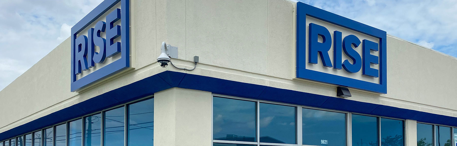


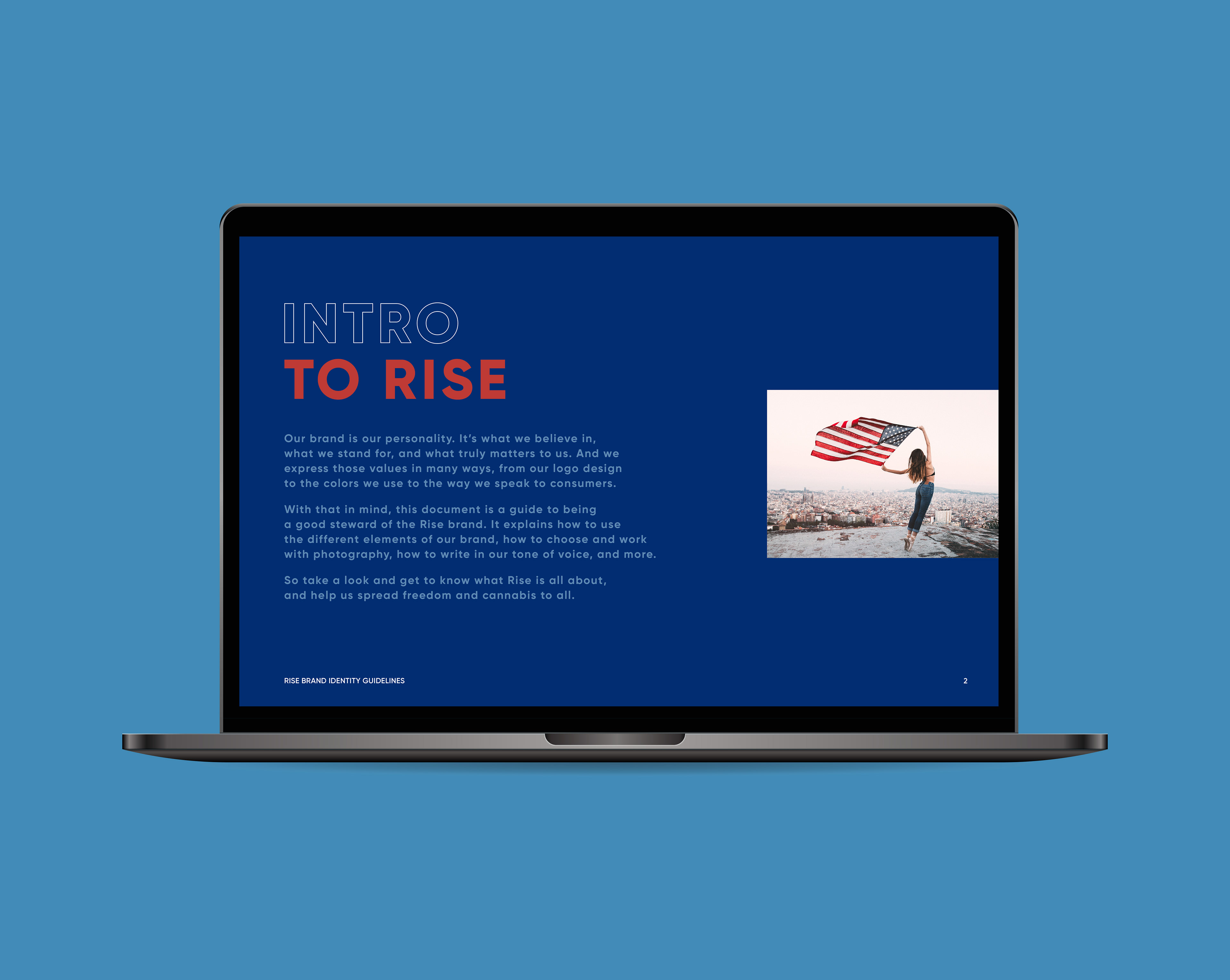
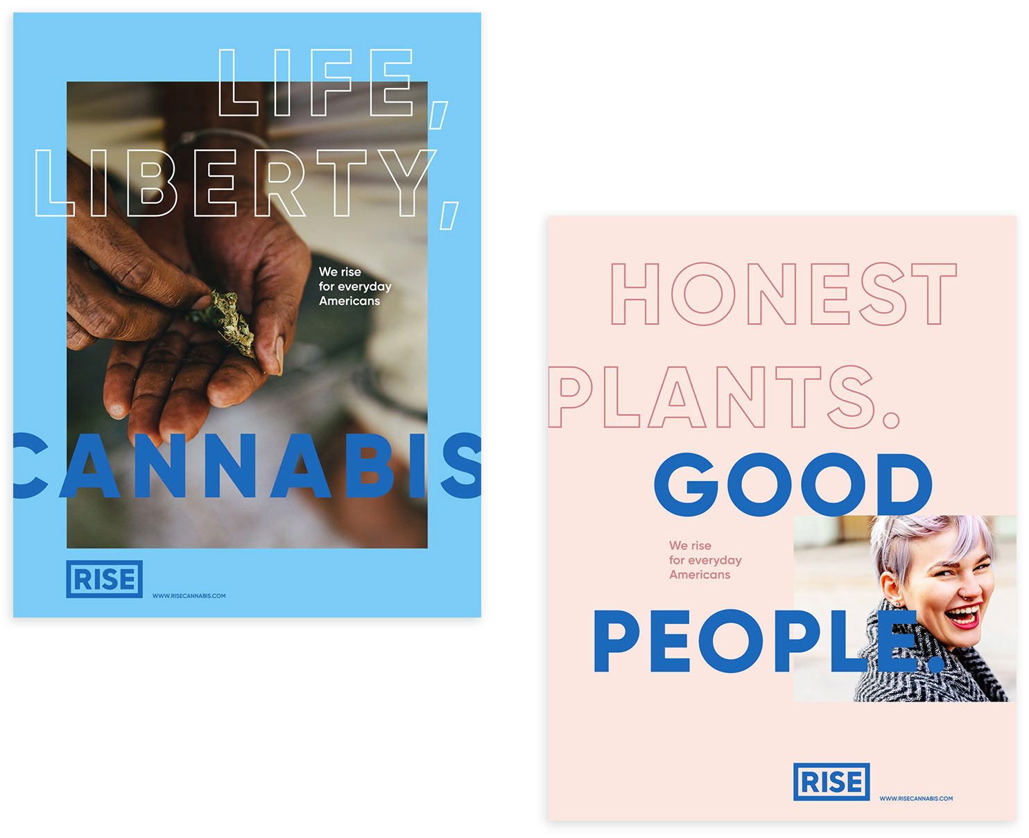
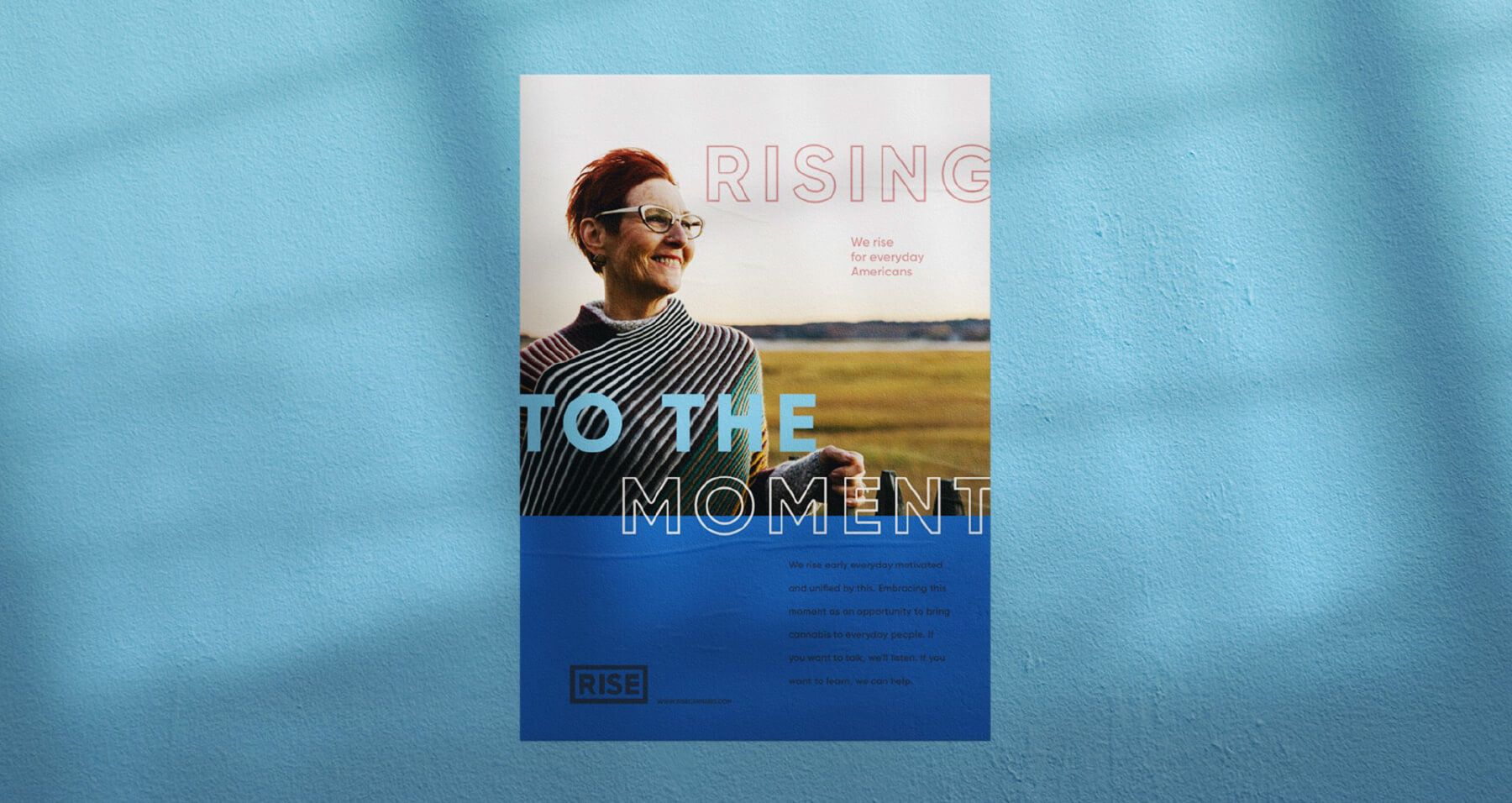
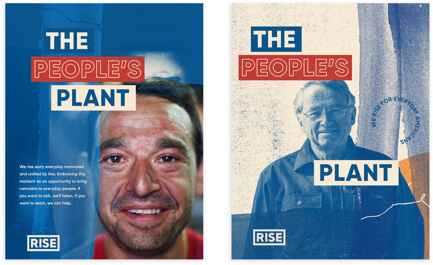
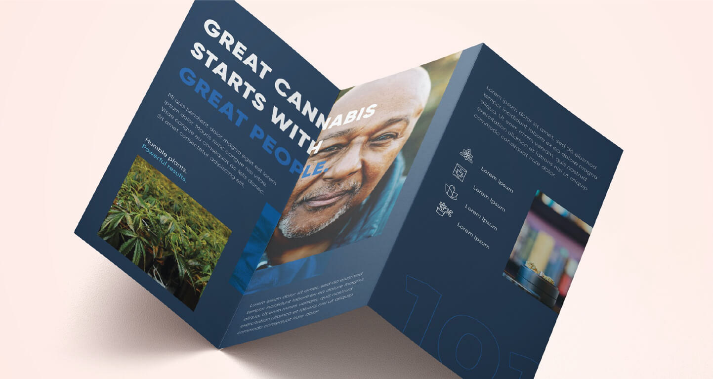
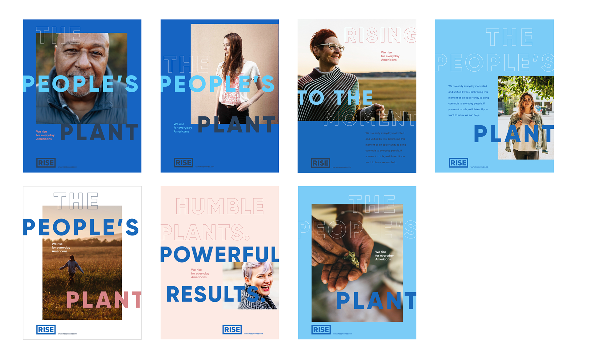
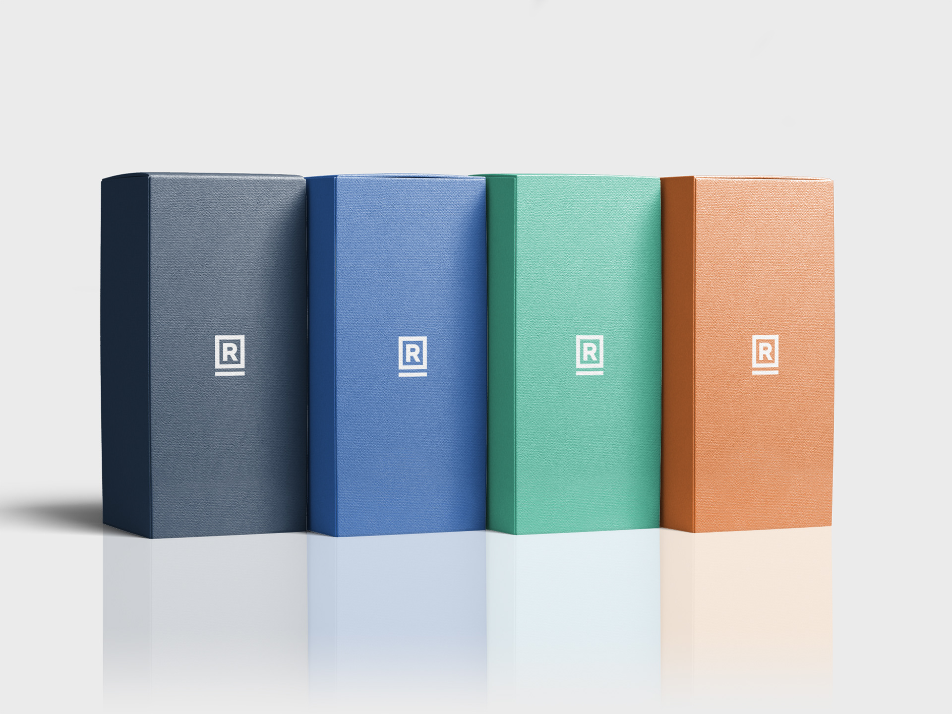

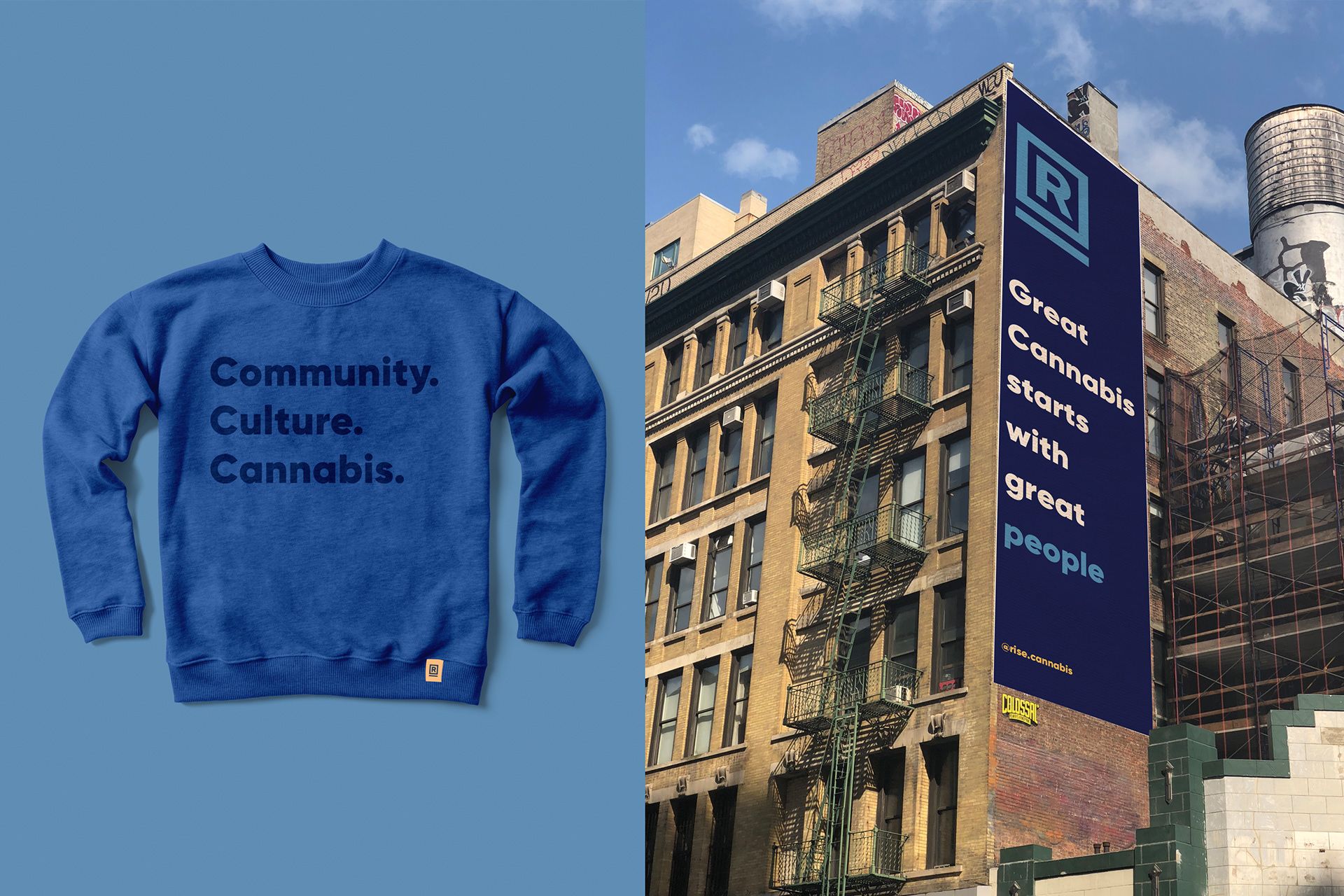


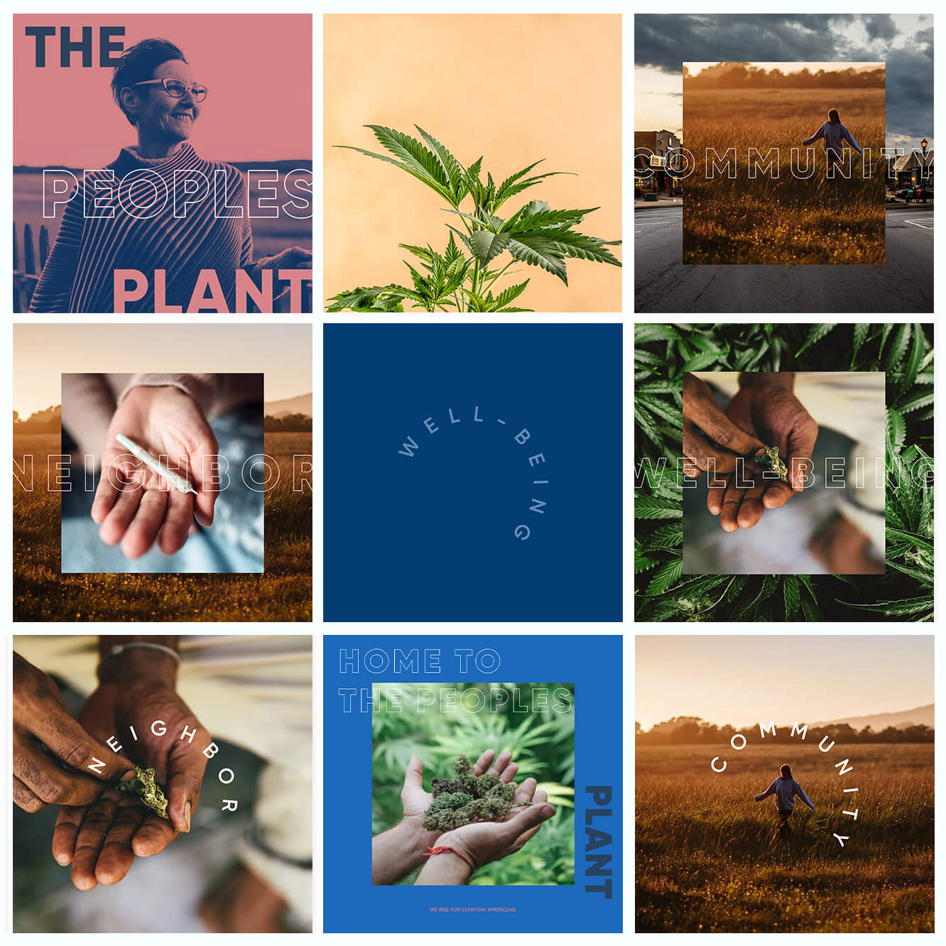
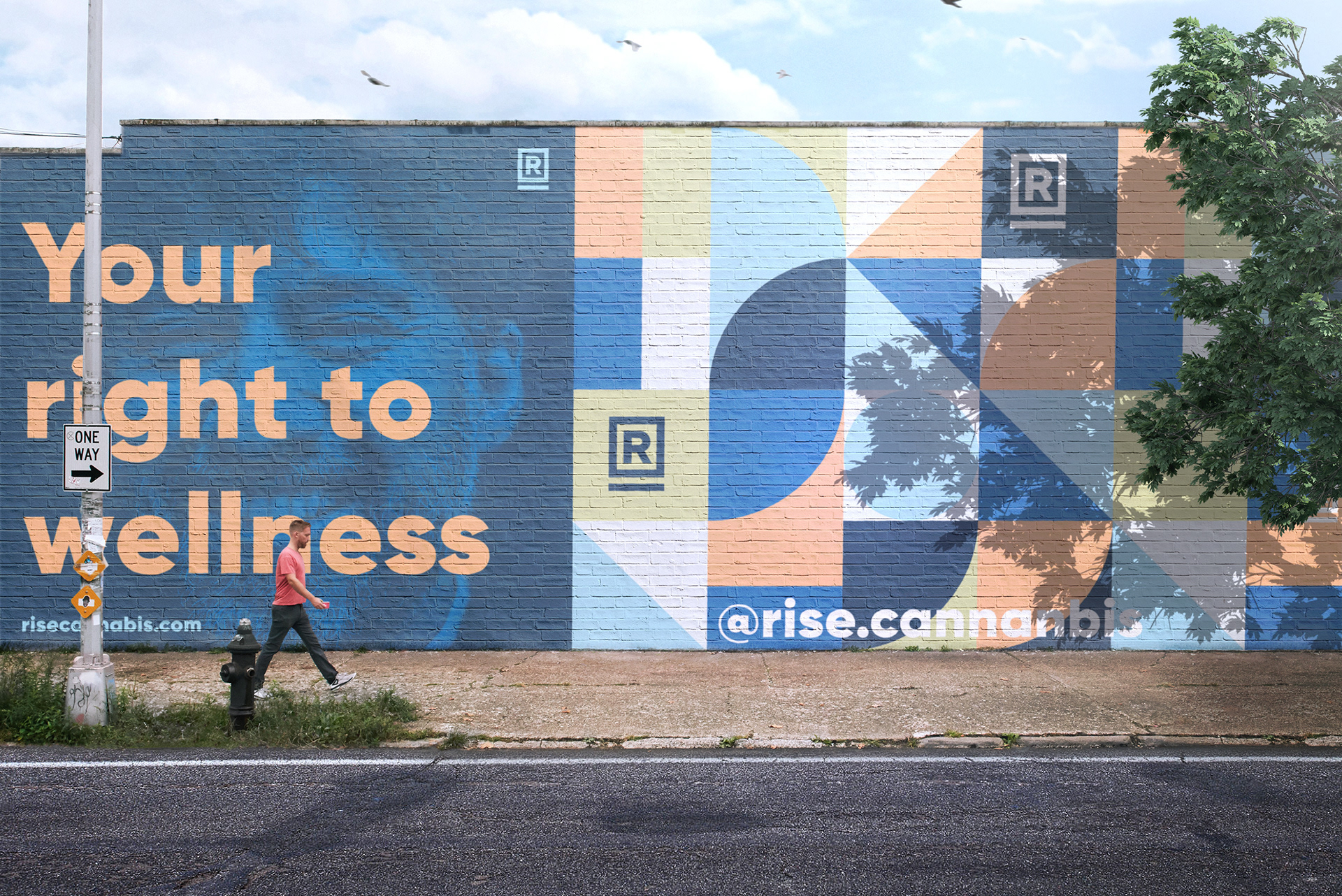
In 2016, medical cannabis was becoming legal in the majority of the United States leading to new brands entering the landscape at an unprecedented rate. Between increased competition and their own expansion, it was a time of great evolution in the industry and RISE needed an identity system that could grow alongside their company culture. — The foundational thinking for the design system that would follow became establishing RISE as a "place" in one's consciousness. The logo was refined to feel more prominent and more permanent. Incorporating open letterforms into brand typography signals the company's value of transparency, as well as their goal to demystify "the people's plant." Documentary-style photography was used in creating a cohesive look that focuses on the human side of the enterprise and thereby inviting an audience that had previously been made to feel like outsiders. The vibrant but calming color palette also helped establish the vision of what cannabis can be – positive, free, hopeful and American.